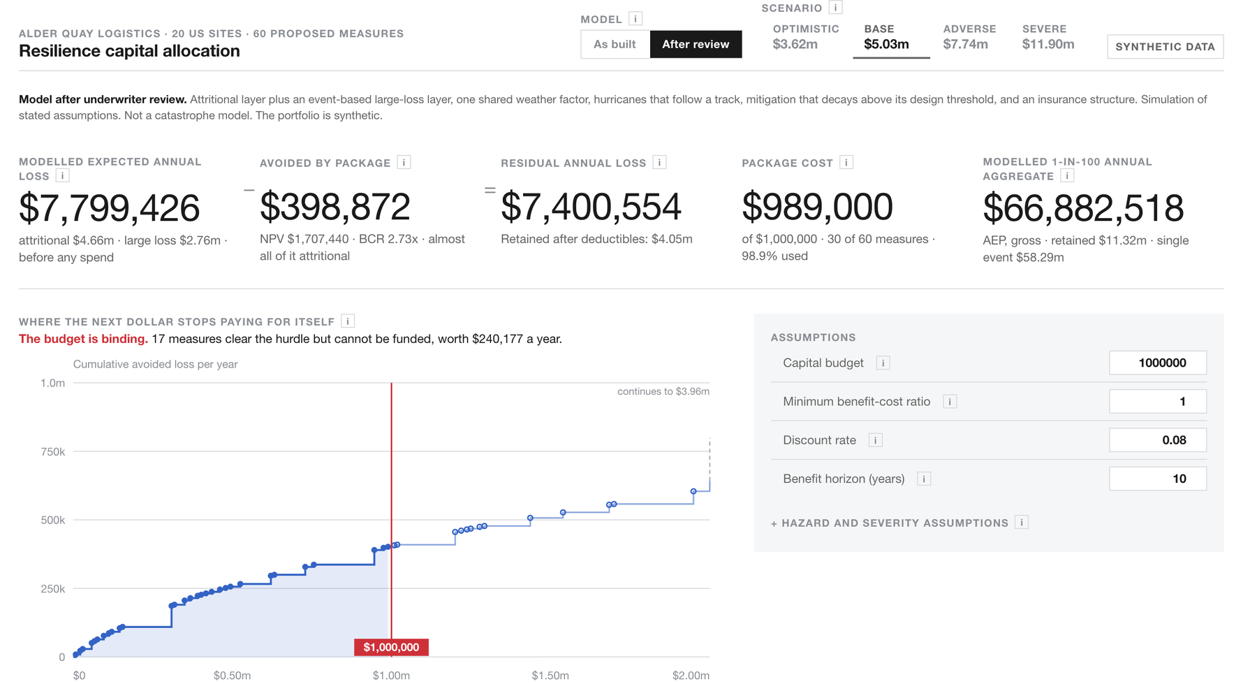
We do a fair bit of work in insurance at the moment, and one question keeps coming up in slightly different words every time. How far can this actually go on real work? Not summarising a document. Real work.
So we gave it a real one. We had it build an insurance risk model end to end, from the loss history to the spending decision, and then we tried to break it. Here is what happened, including the part where it turned out to be wrong.
Starting with the data
For a public write-up like this one we use synthetic data throughout. So we built a fictional company from scratch.
Alder Quay Logistics. Twenty warehouses across the United States, $1.18bn of insured value, nearly four years of claims, inspection reports, valuations, hazard scores, and sixty proposed resilience measures with costs against them. Three and a half thousand records across twenty-one tables. All invented, all internally consistent, none of it real.
Then we gave it a job. Here are twenty sites. Here are sixty things you could spend money on. Here is a million dollars. What should we buy?
Worth being precise about whose decision that is. It is the warehouse owner's loss-prevention budget. It is not pricing, it is not an insurer's capital, and it is not a catastrophe model.
Ninety-eight seconds of the workbook being built, at speed and without sound. The figures on screen come from the original loss history, before we regenerated it.
What came back
A twelve-sheet Excel model.
Not a spreadsheet with some sums in it. A complete risk register calculating expected annual loss for every site and every peril, split into property damage and business interruption. An investment tab ranking all sixty measures by benefit-cost ratio and selecting a package inside the budget. Four scenarios. A thousand-trial Monte Carlo simulation. Two sensitivity grids. A sources tab separating what was researched from what was invented from what was assumed.
That took about 15 minutes.
And a checks tab. Twenty reconciliations, all passing, built without being asked.
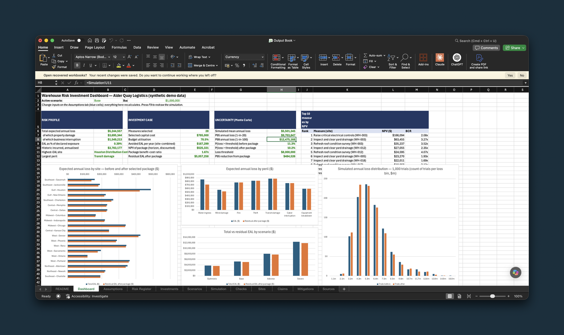
The workbook it produced, unedited. The tab strip along the bottom is the model: assumptions, risk register, investments, scenarios, simulation, checks, sites, claims, mitigations, sources. The figures on screen are from the original loss history, before we regenerated it.
We then turned that workbook into something you can actually drive, which is where most of this work goes wrong for people. A spreadsheet is where analysis goes to be ignored. So we used Claude Fable to port the whole model into an artefact where every control recalculates instantly.
That took about 20 minutes.
And then the awkward bit
It looked brilliant. It was laid out properly, the arithmetic reconciled, the checks passed, and it answered the question we asked it.
But there is a problem, I'm not an insurance expert. I have no idea whether it is right.
I am not an underwriter. I have never priced a property book. I could check that the model did what it said it did, and I did, to the penny. But whether the answer it gives is a sensible view of risk is a different question, and it is one I am not qualified to answer.
This is the bit I think gets skipped. We are all getting quite good at making AI produce impressive output. Far fewer of us can tell whether the impressive output is any good. And the better it looks, the less likely anyone is to ask. If there is a hallucination in there, how am I going to spot it?
And being completely honest, it feels a bit wrong. It is seductive, this. I sat there for the best part of an hour and produced something properly complex, something that would have been weeks of work for a team, and it looked the part from the first screen. That is a lovely feeling. It is also the problem. What I had made was exactly as far beyond my judgement as it was beyond my effort.
Everything that comes out of these things is a hallucination. Some of them just happen to be right. A beautifully formatted model is still a guess until somebody who knows the subject has been through it.
So the key thing for me is not the model. It is who reads it. None of this becomes worth anything in a business until it lands in front of experienced, capable people who can tell whether it is any good, and who are allowed to say no.
So we got it marked
We put it in front of a different frontier model, and gave it a role to play. Twenty five years in commercial property and inland marine. Has run a cat-exposed North American warehouse book. Then we handed over the model with all its workings and told it not to be kind.
I want to be straight about what that is. That is a model playing a part. It is not an underwriter, and nobody should read it as one.
The review came back hard.
It did not say the model was rubbish. It said something worse:
The shape is competent, the numbers were produced by someone who has never seen a cat loss or a warehouse fire. Not rubbish, but "they do not know what they have built", which for a credibility pitch is the more dangerous of the two.
What it found
Three things, and all three checked out when we went and looked.
The loss history was fake in a way a professional would spot immediately. Not fake as in synthetic, we were open about that. Fake as in machine-made. Every single site had exactly six claims. All seven perils had within three claims of each other. Real loss runs never look like that. We went into the generator and found the cause in one line: it was assigning claims by going round the sites in order.
The model could not imagine a warehouse burning down. This is the one that stopped me. The biggest site in the portfolio is worth $105m. We ran the simulation for two hundred thousand years. It never once produced a loss that big, and the worst year in the whole run was about half of it. Nothing in the model represented a single site burning down as an event in its own right, so the tail had nowhere to go. A warehouse fire is an ordinary thing.
The headline benefit was an accounting artefact. The model said the million-dollar package reduced the risk of a very bad year. It did not. The mitigation had been applied as the same percentage reduction at every severity, so the whole distribution just shifted sideways by three and a half percent. The tail "improvement" was that same three and a half percent wearing a different hat. A flood barrier stops a small flood and does nothing at all in a big one, and the model had no concept of that.
The root of all three was the same. The tail had been calibrated from four years of claims whose biggest was $612,600, which is about half a percent of one site's value. There is no catastrophe anywhere in that history. So the model had never seen one and could not invent one.
It was an excellent model of small losses being asked a question about big ones.
Rebuilding it
This is the useful half.
The reviewer (OpenAI Astra) was clear about what to keep, and that mattered as much as the criticism. The way it calculated expected loss, the way it ranked measures by value for money, the way it stacked multiple fixes at one site without double counting the benefit: that is genuinely how this gets prioritised in practice, and we did not touch it. It is not spotless. The package total still adds up each measure's benefit as though it were the only one, so the headline return on the package flatters itself by a few percent. The method was the right shape.
What we rebuilt was the risk side. Events that happen to specific sites rather than an average spread across the portfolio. Hurricanes that follow a track, so Houston and New Orleans can be hit by the same storm. Fire as a coin-toss on whether the sprinklers hold, which turns the sprinkler credit into one number you can argue with. Mitigation with a design threshold, so a barrier works up to a point and then stops working. Deductibles and a programme limit, so the page can show what the company carries and what the insurer carries.
And we regenerated the loss history properly, with a realistic mix of perils and one genuine large fire in it.
There is a switch at the top. Flip it.
The one-in-a-hundred-year loss goes from $15.6m to $66.9m.
Same data, same sites, same budget. Four times the number, because the first version had no way to picture the fire.
Two things to be straight about. The original method runs a thousand simulations where the rebuilt one runs fifty thousand, and the two headline figures carry different labels on the page. Neither of those accounts for a gap that size.
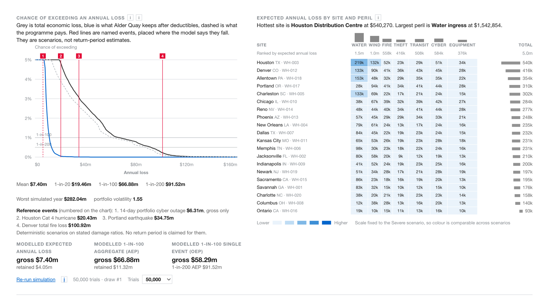
The rebuilt model. Grey is the total economic loss, blue is what Alder Quay keeps after deductibles, dashed is what the insurance programme pays. The red lines are named events placed where the model says they fall, including a total fire loss at the Denver site. None of that was possible in the first version.
The part I want to be careful about
The critic is also a model.
It got one of its own claims wrong, and we only know because we checked it. It said a three week cyber outage on its own would exceed the model's one-in-twenty year loss. We ran it. $9.47m against $9.74m. Very nearly, which makes the point, but not quite, and "very nearly" is not what it said.
More seriously, the parameters it told us to use did not work. It specified an event frequency, a set of damage ratios, and a target for the one-in-two-hundred year loss. We tested those against each other and they cannot all be true at once on this portfolio. We had to depart from its instructions and say so.
So this is not a story about AI checking AI and everyone going home happy. It is a story about a second opinion being worth having, and still needing a human to referee it. Every number in the rebuilt model is labelled on the page as an assumption. It says on its face that it is not a catastrophe model. It will not give you a PML either. It is an illustrative simulation on synthetic data and stated assumptions, and it is not a basis for pricing, capital or risk acceptance.
With a client, this is the point you put it in front of your own underwriters. And the conversation you have with them is a much better one than the conversation you would have had with a blank page.
What I take from it
The capability is real. An hour of work produced something I would have expected to take an analyst weeks. That is my estimate rather than a measurement, and the hour was the build: preparing the data, challenging it and checking the rebuild all sat on top. The structure of it was sound enough that a hard critique made it better rather than binning it.
It is also jagged. Brilliant at the thing it was good at, confidently wrong about the thing it had never seen, and the two look identical on screen.
The skill worth having is not prompting. It is knowing what to check, and being honest when you are not the person who can check it.
Which is why the next thing I want to do with this is not build another version of it. I want to put it in front of some of our insurance colleagues and hear what they actually make of it. Two models marking each other's homework is a start, not an answer. If you price this sort of risk for a living and you fancy pulling it apart, I would genuinely like to hear it. My guess is you will find things both of them missed.
Have a play with the model above. Switch between the two versions and look at what moves. The gap between them is the whole argument for having someone read the output.
Questions
Can AI build a working risk model on its own?
Structurally, yes. Given a synthetic portfolio and a budget it produced a twelve-sheet Excel model with a risk register, a benefit-cost ranking of sixty measures, four scenarios, a Monte Carlo simulation and twenty reconciliation checks that all passed. Whether the numbers in it are a sensible view of risk is a separate question, and on the first version they were not.
How do you check whether AI output is any good?
There are two checks and they get conflated. The first is whether the thing does what it says it does: the arithmetic, the reconciliations, the sources. You can do that yourself. The second is whether the answer is sensible in the subject, and that needs somebody who has done the work for a living.
Can one AI model review another one's work?
It is a useful second opinion and it is not a sign-off. The review here found three real faults, and all three checked out against the model. It also got one of its own claims wrong, and the parameters it told us to use could not all hold at once on this portfolio, which we only found by testing them.
What did the review actually find?
Three things. The synthetic loss history was machine-made in a way a professional spots instantly, with every site carrying exactly six claims. In two hundred thousand simulated years the simulation never produced a loss as large as a total loss at its own biggest site. And the headline benefit of the investment package was an arithmetic artefact, because mitigation had been applied as the same percentage reduction at every severity.
Was any real client data used?
No. Alder Quay Logistics is a fictional company, and the sites, valuations, claims and sixty measures are all synthetic. No client is named or identifiable anywhere in the model or on the page.
Is this a catastrophe model?
No, and it says so on its own face. It is an illustrative simulation on synthetic data and stated assumptions, with every assumption labelled on the page. It is not validated, and it is not a basis for pricing, capital or risk acceptance.
Alder Quay Logistics is a fictional company. The sites, the claims, the valuations and the sixty measures are synthetic, built for this exercise. The model, the arithmetic and the selection logic are real. The screen recording and the workbook screenshot were captured before we regenerated the loss history, so the figures in them do not match the current model.